
Say ‘Hello’ to the New Transifex
For the past few months, our team has been heads down working to revamp the Transifex app and website. Not only did we set out to give Transifex a much-needed facelift, but we wanted to make the whole product easier to use too. We’re excited to finally share the updates with you. Here’s a look at all of the changes being released.
Simpler navigation in Transifex
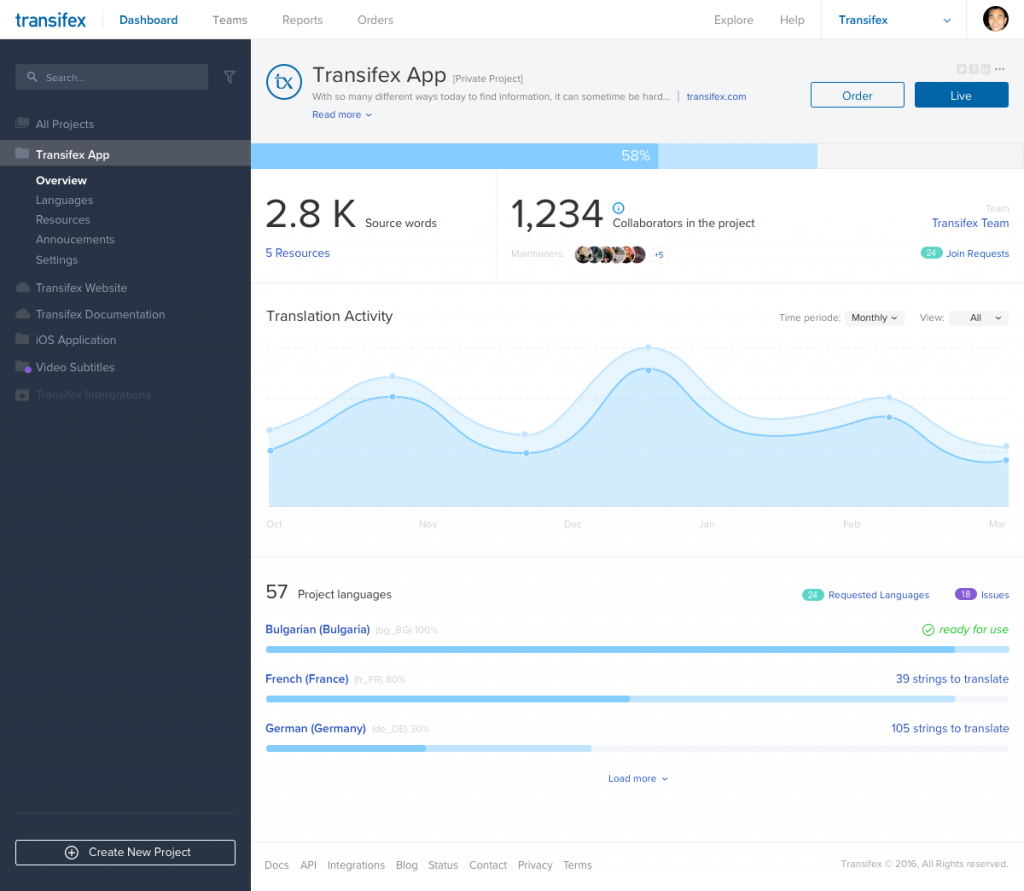
Inside Transifex, you’ll see a brand new project navigation that’s designed to make accessing various subpages and settings easier. For example, when you click on a project, the most important subpages will be shown under the project name, so you won’t need multiple clicks to access these areas.
As you navigate through the Dashboard, the project navigation stays with you, so you can quickly jump to a different subpage with just a click. And the right side of each page updates without needing the page to be reloaded. It’s pretty sweet!
One thing to note is that the project details page has been removed – all ithe information there is now available in either the project overview or Languages subpage.
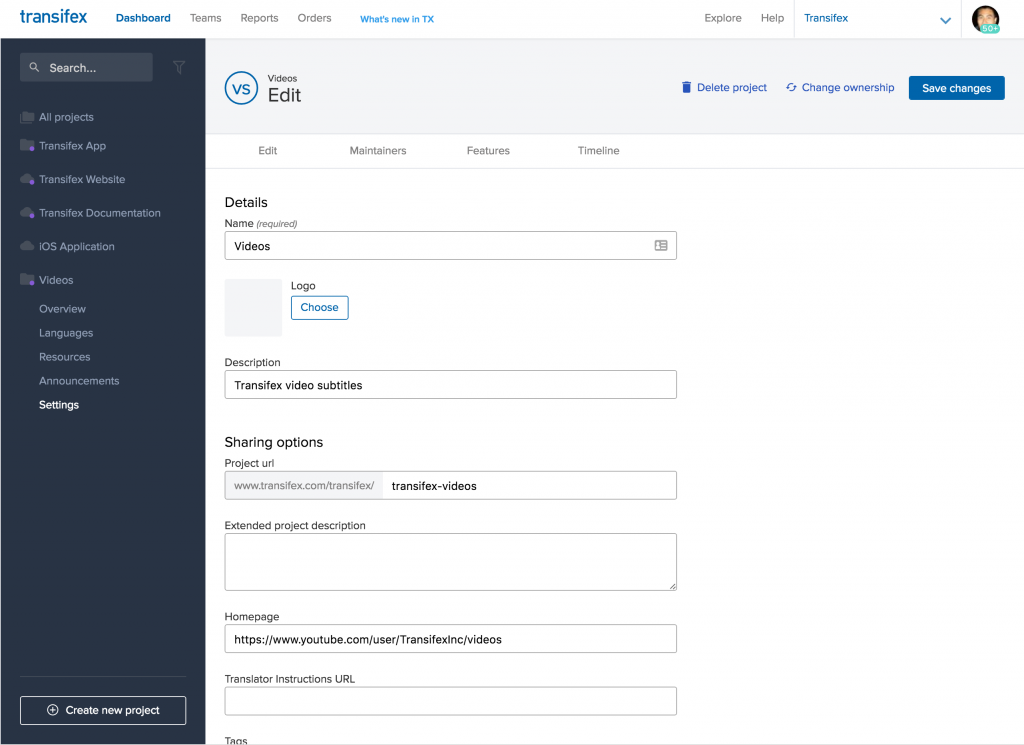
Reorganized project settings
In place of the old, cluttered project settings, we’ve made Settings a single subpage that you can access straight from the project navigation. Once you’re inside the project settings, you’ll see that everything is now organized under one of four tabs so you can quickly find and change the settings you need. For example, Machine Translation and Translation Memory settings are now (intuitively) grouped in Features. And project deletion and ownership change options are in the Edit tab.
Faster app performance
Under the hood, we got rid of some legacy code that was slowing things down, and implemented new, clean code, loading everything in Pjax. Thanks to the new code, Transifex should feel snappier – even when you have a lot of projects or collaborators.
New Fonts, Colors, and Logo
We like to think that we’ve always been a friendly, accessible company and brand. But our brand visuals didn’t necessarily express that. With major UI/UX changes in the works, it just didn’t feel right to mix our old visual identity with the new designs. So we refreshed our logo with a design that’s more relaxed, and updated the colors throughout our app and website to be more fun and modern. Hopefully you’ll like the choices we made 🙂
Reorganized Docs
Rebuilding the app gave us a chance to redo our documentation too. Our product docs are now organized around specific questions, so it’s easier to find the answers you need.
It’s still a work in progress and we’ll be continuing to improving our docs over the next few months, so don’t worry if something you’re hoping for isn’t there today. In fact, if you have a suggestion, please let us know through our contact page.
We hope you enjoy these changes (and the many other minor ones which weren’t mentioned in this post). Send us an email at hi@transifex.com and let us know your thoughts!

