
Designing a Localization-Friendly User Interface (Part 1)
More and more businesses are expanding into new foreign markets, and are realizing that in order to be successful, the target market’s local customs must be recognized, respected, and reflected in any digital content. In this two part series, we’ll discuss the challenges involved in creating a user-friendly interface and present a few best practices that will meet (and exceed) the needs of your multilingual users. Part 1 will focus specifically on the importance of a flexible and dynamic layout for overall consistency.
Design Your Layout to be Flexible and Dynamic
Some languages are more verbose than others, meaning your design must account for text expansion and contraction in translated languages. The general rule is to plan for an average of 35% text expansion. The example below illustrates how the character length of a text string will vary from language to language.
| English | Transifex makes localization easy. |
| Dutch | Transifex maakt lokalisatie gemakkelijk. |
| Chinese Simplified | Transifex 使得本地化容易。 |
| Hindi | Transifex स्थानीयकरण आसान बनाता है। |
Development frameworks provide features that can help you to program dynamic UI expansion and contraction. Although the intricacies may vary based on the framework, the design considerations detailed below are mostly common.
1. Sizing Metrics
Your user interface window and elements should be laid out relative to each other without fixed positions or sizes in order to allow them to realign as required for every language.
- Container: Your design should let the main container/wrapper adjust to the size of the contained elements that may change with every language.
- Elements: Avoid using fixed width/height constraints for buttons, labels, text fields, images, menus, dialog boxes and all other elements of the interface. Setting fixed sizes may lead to your text appearing cropped or create excessive empty space in some translated languages.
2. Right to Left Flip
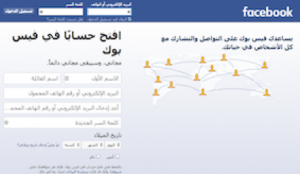
In certain languages like Arabic and Hebrew, text is read from right-to-left (RTL) necessitating your entire design to be flipped. A modular design approach will come in handy while accommodating RTL languages. For example, the homepage of Facebook is designed to flip neatly for Arabic and other RTL languages as shown below:
When localizing, the below elements should not be mirrored in RTL languages:
- Images, except when they correspond to direction (example: arrows)
- Graphs (x– and y–axes are always shown in the same orientation in all languages)
- Music notes and sheet music
- Clocks
- Video controls and timeline indicators
Most of the recent native frameworks are now mirroring aware, making it easier to create a mirrored layout with very limited code changes.
Example 1: iOS Support for RTL
Starting from iOS 9, there is comprehensive support for a mirrored user interface as listed below:
- Make use of base internationalization and Auto Layout
- Standard UIKit controls automatically flip in a right-to-left context
- UIView defines semantic content attributes that allow you to specify how particular views should appear in right-to-left context. You can get the layout direction of an instance of UIView by calling the userInterfaceLayoutDirectionForSemanticContentAttribute, method as shown: if ([UIView userInterfaceLayoutDirectionForSemanticContentAttribute:view.semanticContentAttribute] == UIUserInterfaceLayoutDirectionRightToLeft) { … }
- In iOS, using natural text alignment aligns text on the left in a left-to-right language, and automatically mirrors the alignment for right-to-left languages. For example, if you set the alignment of an NSMutableParagraphStyle object using the setAlignment: method, you should pass NSNaturalTextAlignment as the parameter.
- UIImage offers the method imageFlippedForRightToLeftLayoutDirection, which makes it simple to flip an image programmatically when appropriate.
You can refer to the official Apple documentation for details about iOS support for internationalization.
Example 2: MSDN support for RTL (mirroring awareness)
You can activate mirroring and also have full control over when to enable mirroring – such as per process, per window or per device context, using the new mirroring APIs offered. You can refer to the developer reference guide for full details.
3. Line Breaking and Word Wrapping
Latin and most Western languages use spaces to separate words. However, East Asian languages such as Japanese, Chinese, and Korean may not use spaces to separate words. Instead, they rely on syllable boundaries. This implies that text wrapping may not always be done by spaces. Consider an example English sentence “I am a student.” The white space between words is often considered a delimiter for word-wrapping, but when translated into Chinese, sentences are written as strings of Chinese characters without any delimiters between them, as shown below:
| English | I am a student. |
| Chinese Simplified | 我是一名学生。 |
For character-based languages, your application cannot rely on the usual line-breaking and word-wrapping algorithms for text parsing or display. Your routines must be able to handle text without spaces or punctuations, especially when wrapping for layout. This is easier said than done because in many cases you will find that linguistic expertise is required to handle this correctly.
For example, your text parsing routine for Chinese will require a specific Chinese word segmentation algorithm. There are many widely used algorithms and you can choose based on your application’s needs. Most of the word segmentation algorithms can be categorized into two types: lexical knowledge based methods (faster but less accurate) and linguistic knowledge based methods (highly accurate).
Select Fonts for Global Consistency
Although it seems like a minor step in the localization process, font choice can dramatically impact the layout and readability of your localized user interface and can also result in an inconsistent look and feel. To avoid picking the wrong font for your product, consider using a font generator to help you choose a font.
Keep the following font-related notes in mind.
Fonts Must Provide Multi-Lingual Support
First and foremost, you need to choose a font that is Unicode-compliant, meaning the characters and text of your application have been encoded in a way that enables the exchange of text data internationally. It’s risky to assume that all fonts claiming to be Unicode will address all font-related issues in your multilingual interface. Some Unicode fonts may only support characters at the correct code-point and may not have usable characters for all code-points.
To prevent issues with Unicode fonts, refer to the recently introduced Google Noto Fonts, which aim to provide pan-language harmony and can be used for web as well as desktop applications. There are many Unicode resources where you can search for a list of fonts that are Unicode compatible and the characters they support.
Font Sizes Vary from Language to Language
A 12px font may be readable in English with no issues, while the same font may be extremely difficult to see when translated into Japanese. That leaves us with the question, is there an ideal multilingual font size? Unfortunately, there isn’t an ideal font size that works for all languages across the globe, but one option is to implement a dynamic layout to handle varying text size. If you wish to maintain a globally consistent layout, you could also adopt a variable font size option to give a better user experience across languages and devices. We’ll use the following example to explain further.
If you are designing a website, then it is common practice to use separate language-specific style sheets and define specific styles to suit every target language. In the example below, the font-size for the text “I am a student” will vary, based on the language, as specified in 2 different stylesheets style.en-US.css and style.ja-JP.css.
| English (style.en-US.css) | Japanese (style.ja-JP.css) |
| p { font-size: 14px; } | p { font-size: 16px; } |
| I am a student | 我是一名学生。 |
Manage Content for Different Global Markets
Now that we’ve discussed how to lay out your website to create a localization friendly user interface, we must address how to manage your content for different global markets. Because that’s going to take more than a few sentences, we’re going to save it for later this week, so check back for part 2 of our designing a localization friendly user-interface series!


